Category Art
Published July 21, 2026
Cut Out book, Jihae Choe
Story Flavour: strongly brewed black tea with plain biscuits
Story Scent: burnt wood from laser cutting
Story Sound: a track with a deep bassline
Jihae Choe doesn’t think of herself as a graphic designer. The definition she reaches for instead is typography experimenter: a term that better captures the dynamism of a practice that moves between books, video works, and installations, always returning to the letter as its primary material. For Choe, typography is not a neutral system but a democratic medium: a form that works precisely because a community has agreed to engage from a point of shared understanding. Her interest as an artist lies in testing that agreement, in finding where the promise of language holds.
Choe’s work builds on a conversation that has preoccupied this design practice for decades: what does typography do beyond mere communication? How can the letter become a site for deeper cultural inquiry? From the deconstruction of readability to the somatic experiments of contemporary designers like Zuzana Ličko and Dexter Sinister, the field has repeatedly asked how the letter can become a site for deeper cultural enquiry. Choe’s contribution to this intersectional wave of critical typography is distinctive: she approaches the question from lived experience rather than mere experimentation. Her typography is always political, but its politics are grounded in the body and in memory. She understands what it means to be on the wrong side of a legibility threshold.
English, kinetic sculpture, Jihae Choe
Initially trained in fine art, Choe built sculptures from wood before a growing tug towards graphic design gradually reoriented her practice. This sculptural sensibility has clung to all of her work, visible in the physical weight she gives to letterforms, in her tactile impulse to cut, print, stretch, and motorise typefaces—in short, to make language behave like matter.
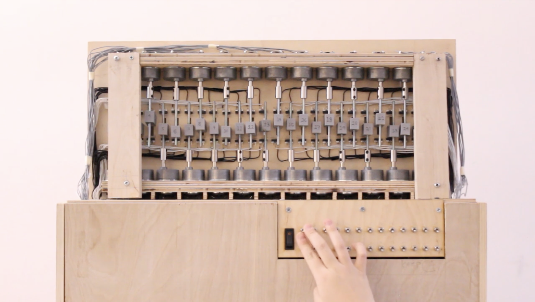
Perpetual negotiation across geographical, cultural, and linguistic borders sits at the heart of her creative concerns. In the kinetic wooden sculpture, English, she takes one of the most loaded words in the contemporary linguistic landscape and submits it to a process of controlled fragmentation. The laster-engraved word is cut into twenty-six vertical chunks of wood, one for each letter of the alphabet it both contains and exceeds. Each slice is driven by a motor and a custom PCB circuit, resulting in a word that is both readable and unstable, its letters oscillating independently, never synchronised or at rest.
No Longer Human, video work, Jihae Choe
In this fragmentation, Choe doesn’t shatter the word into abstraction—even if the act of reading is interrupted, the type is coherent. This is a careful calibration of what theorists call the threshold of legibility: the point at which a letterform retains enough of its structure to be decoded. By operating at the threshold rather than beyond it, Choe keeps her viewers in a state of active, effortful reading, metabolising the work’s argument. With typographic fluency, she reminds us that navigating a second language demands continuous cognitive and emotional labour that native speakers rarely perceive. The sculpture’s materiality reinforces this poignancy. Wood is a traditional, authoritative medium, the stuff of institutional signage, of permanence. Setting it in motion this way quietly destabilises that authority without dismantling it, enacting in three dimensions what non-native speakers negotiate in real time. English was exhibited as part of ‘Sailing Dynamics’, the inaugural QR exhibition organised by N()AS UK along the King’s Cross Canal in 2025. True to its own concerns about the effort of orientation, the work reached audiences through a deliberately non-linear encounter: visitors scanned QR codes to locate artworks across London’s canalside route, charting their own path through the show.
Cut Out, Jihae Choe
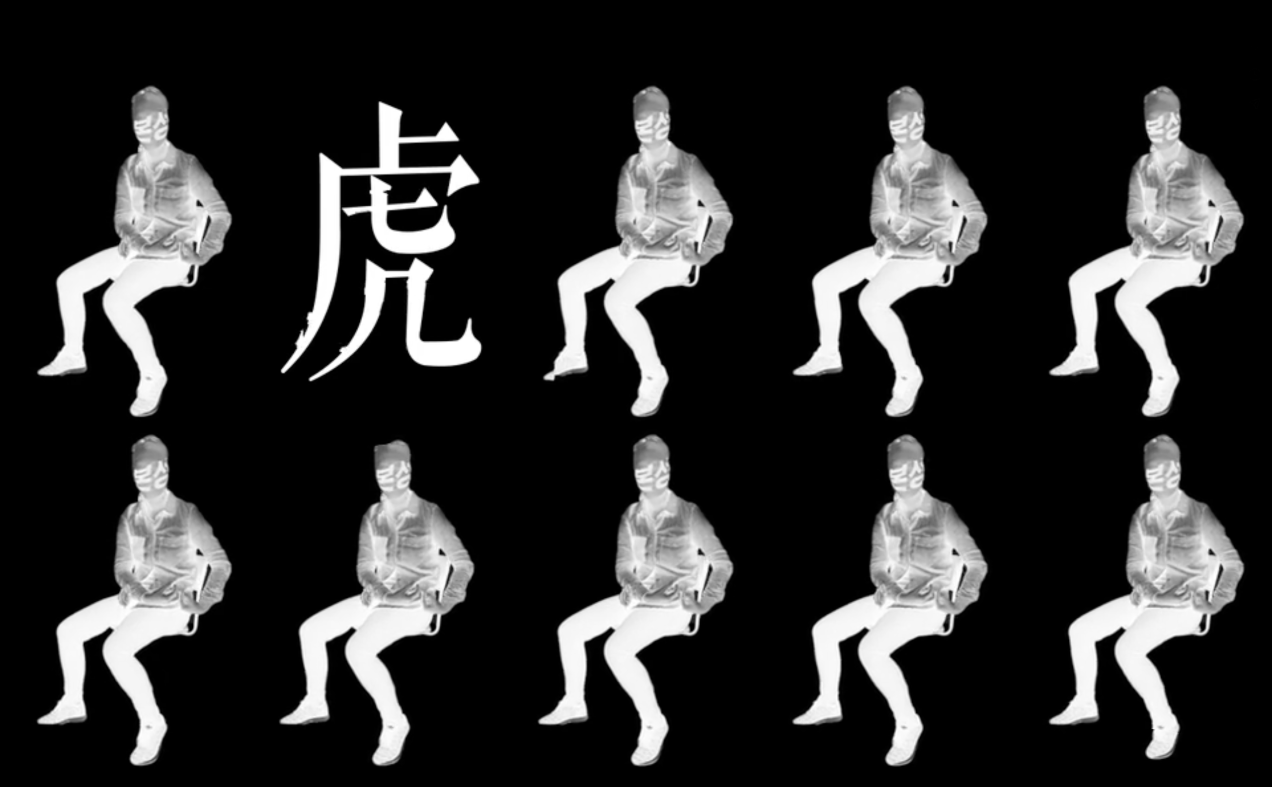
Choe stretches this sideways approach further in No Longer Human, a video work where she filmed herself with a sheer stocking pulled taut over her face, its surface printed with type. Unlike a mask, which holds a fixed relationship to the face beneath it, the stocking here is a variable surface, responding to movement and pressure, stretching and contracting as Choe moves. The letterforms printed on it are consequently never stable: they dilate over the convex planes of cheekbone and forehead, compress in the eye’s hollows, and distort at the edges where the fabric pulls tightest. The type is in constant formal flux, driven not by mechanical means as in English, but by the topography of the body.
More conceptually significant is the way the artist’s face, ordinarily the primary site of identity recognition, is rendered secondary to the text that overlays it. Viewers must read the typography before, or instead of, reading the person. This inversion is the work’s central proposition: for someone whose identity is constantly mediated through language and the negotiation of cultural codes, the text is not a supplement to selfhood, but a substitute.
The title is borrowed, of course, from Osamu Dazai’s 1948 novel of social alienation and the performance of normalcy. There’s an incisive depth to how Choe uses the novel’s logic of self- effacement structurally rather than illustratively, applying it to the specific condition of the diasporic subject. Legibility—linguistic, cultural, and social—is not given here, but constructed.
Cut Out garments, screen print on denim, Jihae Choe, photograph by Bryan Kim
Together with English, both works launch into an implicit dialogue about the relationship between language and identity. One asks what happens when a shared tongue fractures, while the other questions what remains when the face behind the words is obscured.
Cut Out, which was exhibited as part of the 2025 Indie Stage in Seoul, is Choe’s most expansive and formally various projects. Beginning with laser-cut typography and expanding through printmaking, artist books, and garment installations, it develops a sustained visual argument about the mechanisms of social exclusion, specifically within the context of Korean governance and public culture—although its formal strategies speak to broader structures of redaction.
For Choe, the letter is always already a site of identity, and identity is always already a typographic problem. To cut type is to create two simultaneous objects: the piece removed and the relics it leaves behind, both carrying information in different ways. She exploits this duality throughout, using laser-cut letterforms as printing plates for screen printing and lithography, so that the act of cutting generates further marks rather than simply producing absence. This way, the negative space becomes productive. Erasure is reframed as a generative act, an embodiment of Choe’s broader political concerns.
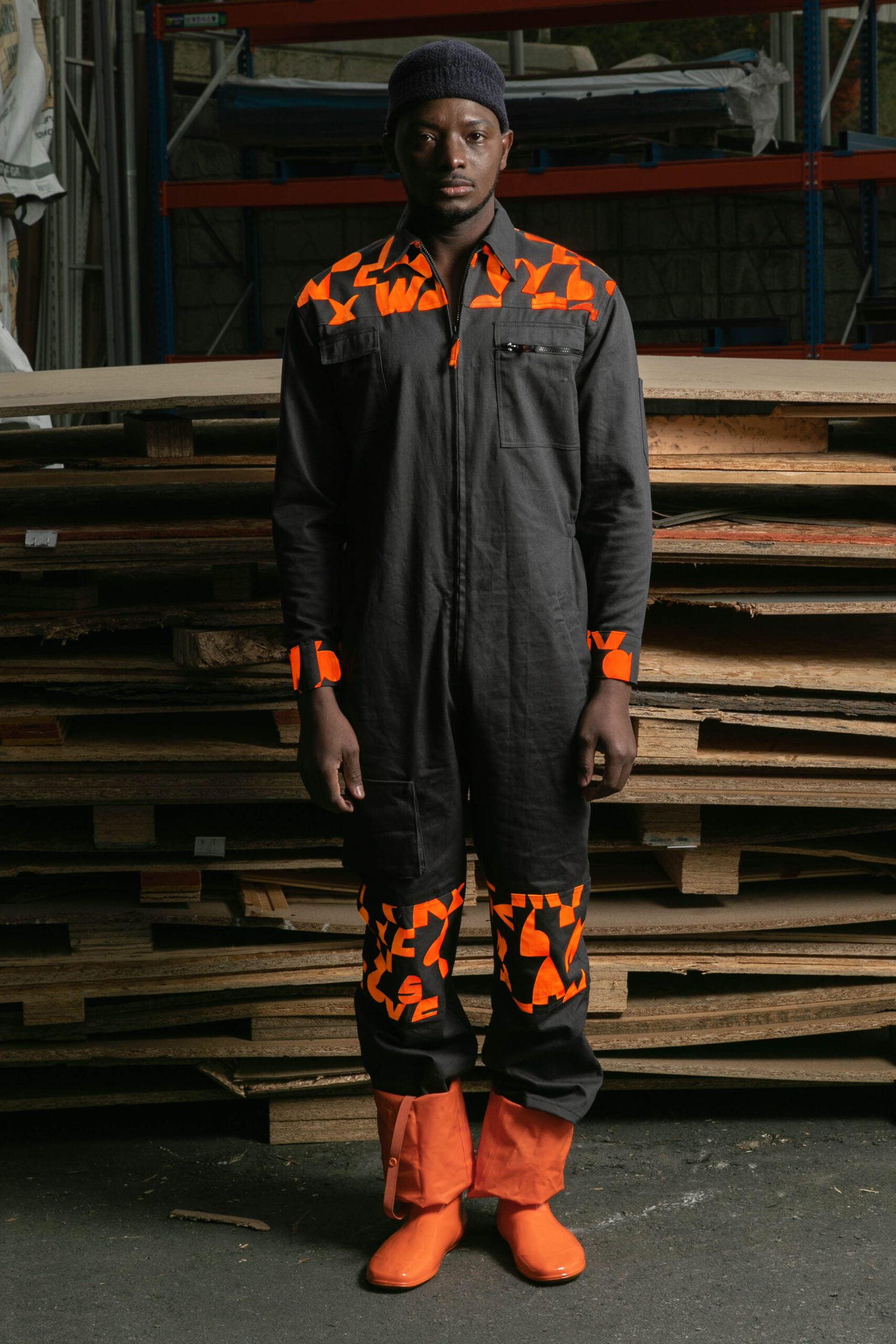
The garment installation extends this logic onto the body. Working in denim—a material with its own historical associations of labour—Choe applies her font in a pattern that must align precisely across every seam. The endpoints of each letterform have to meet exactly at each join, making mass production impossible. Every piece is hence necessarily singular, its message enacted by its form. This insistence on exactitude is intentional: a garment in which the typography cannot be mass-produced, after all, is one that resists the logic of the system it critiques.
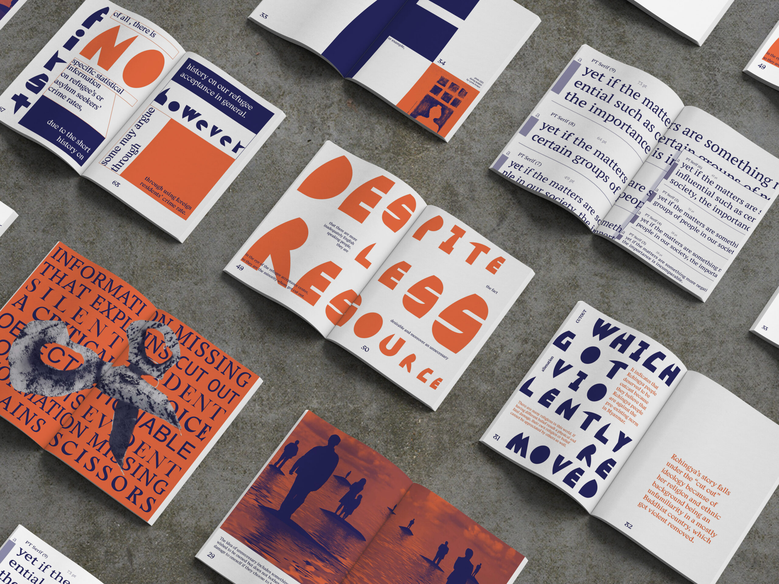
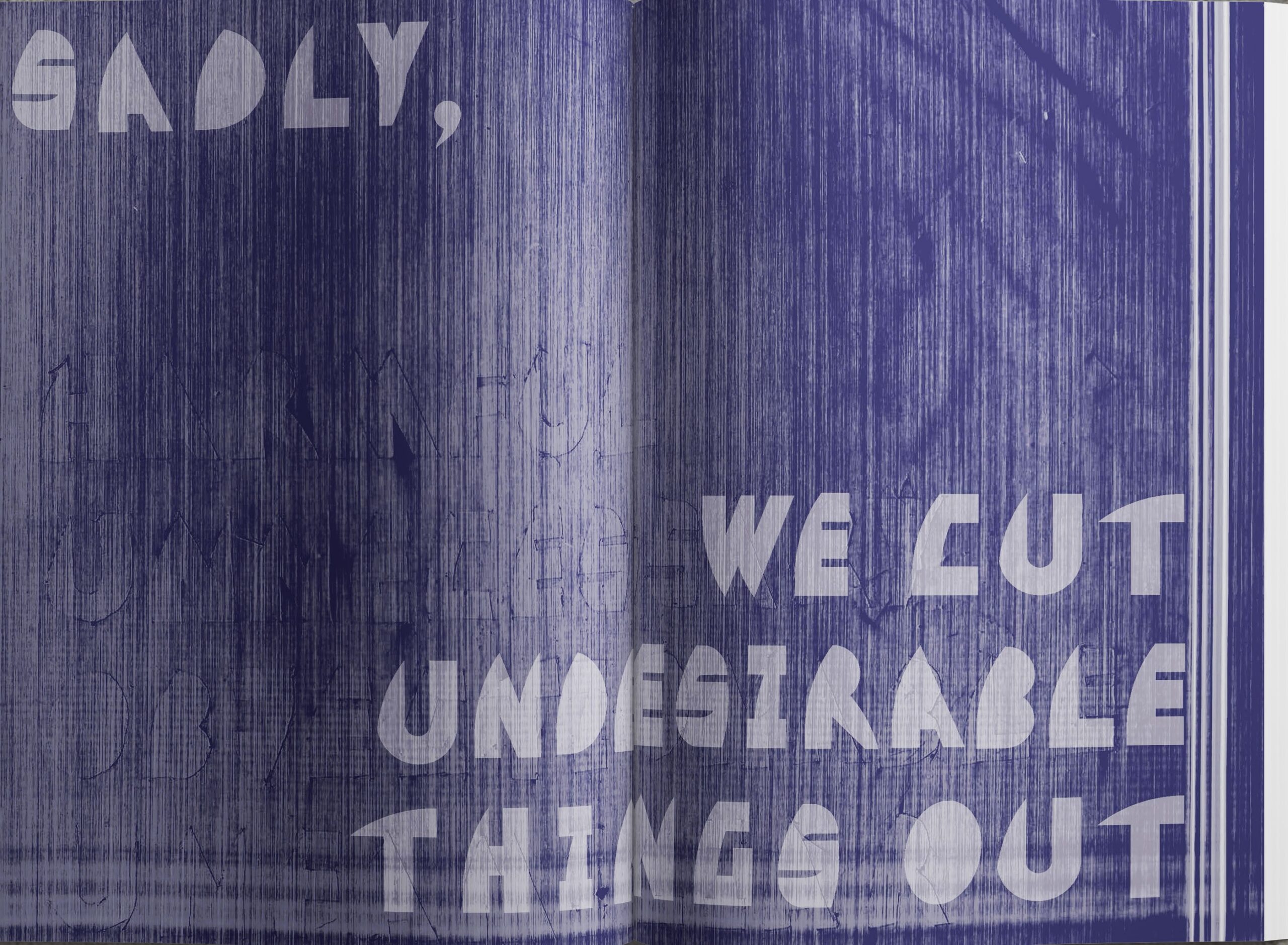
Cut Out book, Jihae Choe
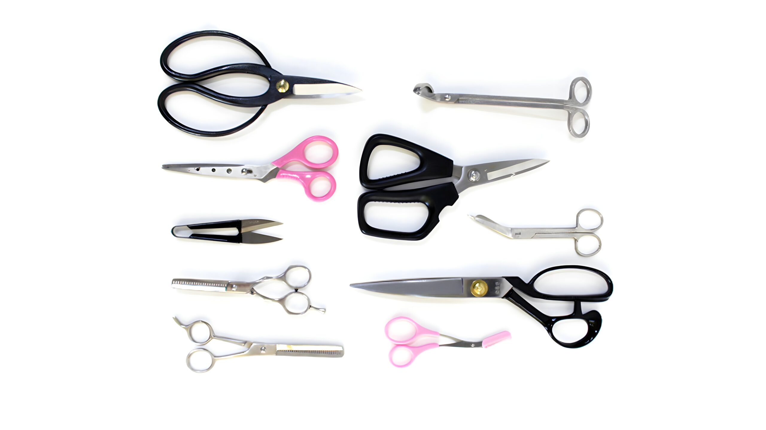
The accompanying book, produced in an edition of fifty, is interspersed with scanned images of laser-cut paper, photographs of scissors, and short passages from novels Choe felt carried the idea of cutting within them. Her scanning process introduces its own visual language: metallic-coated paper stocks catch light differently from uncoated ones, producing surface textures that register the materiality of the cutting process in ways photography alone would not have
captured.
When asked what constitutes a healthy community, Jihae Choe doesn’t reach for policy language. She describes instead a place where people from different fields and disciplines can try to understand one another, mingling across differences. This instinct toward genuine exchange rather than the comfort of shared vocabulary is, perhaps, what animates her art at its deepest level. In expanding the possibilities of what a typographic practice might address and how it can be encountered, her work makes a considered and timely contribution to contemporary design discourse, reminding us that typography is not a static art, but a threshold where belonging is tested, negotiated, and forged anew.